Starship Design System
Design System is a set of standards to manage design at scale by reducing redundancy while creating a shared library and visual consistency across different pages and platforms.
UX Methodologies & Techniques.
Figma
Confluence
Worked with a leading tech company to create a consistent design system by working closely with a design manager and developers to turn designs into reusable products using Figma as the primary design tool. Primary role was Product designer.
One Design System for All Platforms.
All the platforms i.e iOS, PWA & Desktop will be pointing to the same component from the design system. No more seperate design systems for each platforms
The Challenge.

Every time we started a new project or started a new phase of the project we were creating projects from scratch. This would mean setting up a new components library each time. This meant we were designing the same components over and over again with the style changing each time to suit functionality.

We needed to:
Recreate old components

Gather all old use cases and create use cases for each component

The Benefits.

It’s a single source to view components, patterns, and styles. New changes for the same projects can be redesigned and managed at scale through the design system.

Design resources can focus less on tweaking visual appearance and more on complex problems/solutions. This ensures that the project and designs are consistent visually and functionally.

The Approach.
We started with creating a style guide for the system. Luckily for us this one had already been done. All we needed to do was implement any new changes or elements to the system and link the existing style guide.
The Style Guide Consisted of.
  • n-page annotations (how we document and layout each component within the library)
  • Branding (colours, typography, Logos)
  • Spacing guidelines
  • Layout grids
  • Icon pack
  • Border radius guidelines
These style guides are incorporated into the component library as well, to provide relevant guidance in context.
Architecture of Design System.
Etta design system is now divided into 4 seperate files for faster access as shown below
Theme Engine
This file is the heart of Etta branding as this file controls colors, Typography, icons and other styling parameters accross all the platforms & pillars
UI Components
This file contains molecular components such as Buttons, toggles and other elements which can be used to build a complex components.
UI Cards
This file contains all the complex components that are build using molecules presents “UI component file”
Media
This is the library of all illustrations, images, logos and other assets which we can use at the time of designing a screen
Journey of Design System Components
Accessibility & Annotations.
Component Name
Use specific, unique UI component names to avoid miscommunication between designers and developers, ensuring error-free collaboration.
State Changes
Recommended defaults and the subsequent changes in appearance.
Note Making
Page annotations and descriptions to understand what component you were looking at.
Breakpoints
Any size indication and breakpoints for the developers.
The Beginning and the Progress of Colors revamping.
We propose a revamped color system with light and dark modes for a consistent user experience. Using token-based design, colors switch seamlessly between modes.
Improve & Maintain Icon Guidelines for Design System.

Our icons and pictograms are designed to match the style of our brand logo, using similar curves and arrow shapes. They’re made so they look good whether they’re used in big marketing images or tiny app icons.

Base Icon Size
The base size for our icons is 24 pixels. This serves as the starting point for all icon design within our system. Icons should be created and scaled to fit this base size initially.
  • Small : 16px minimum
  • Medium : 24px Default
  • Large : 44px Max
Example to understand the guideline better
Naming of an Icon

Icon Naming: Use clear and descriptive names based on the function for your icons to make it easy for team members to search and find the icon they need.

Naming convention of an icon component
  • Frame > Name of the icon
  • Filled or line based on the icon type
  • Icon layer > Vector
Awards & Acheivements.
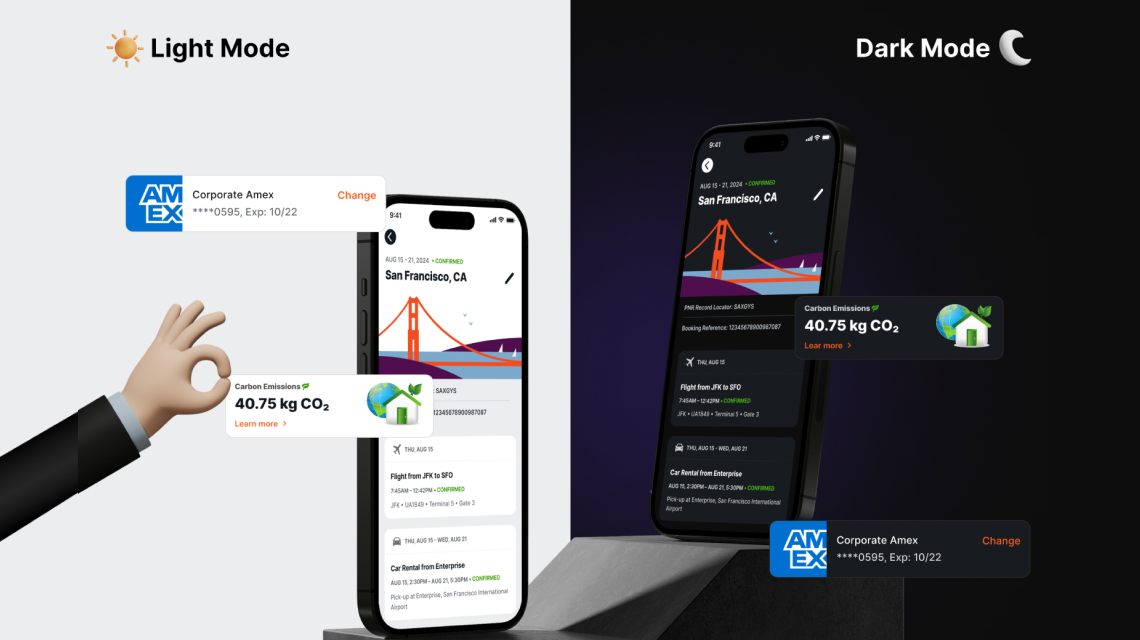
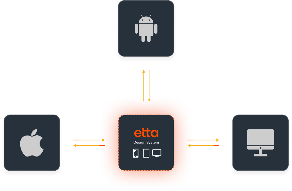
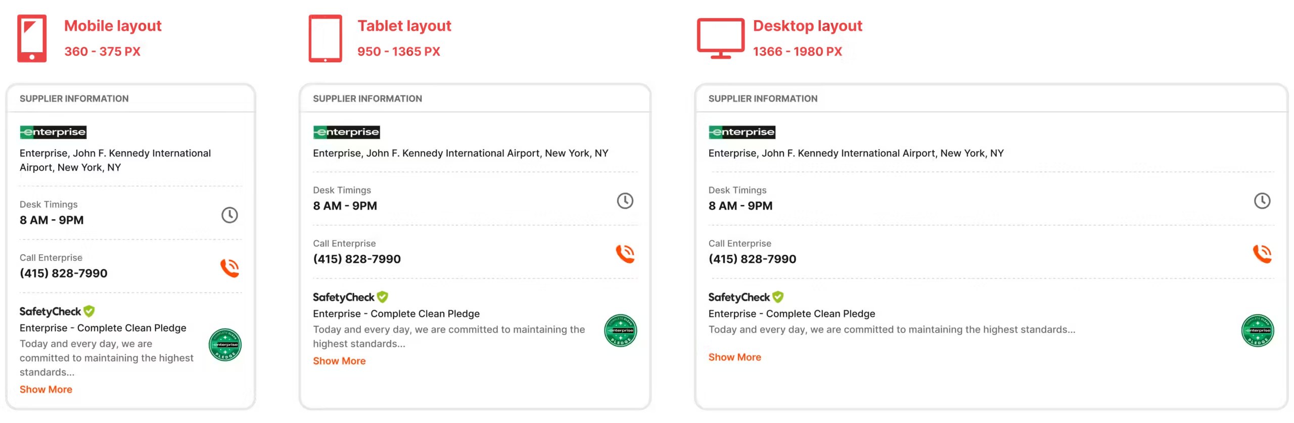
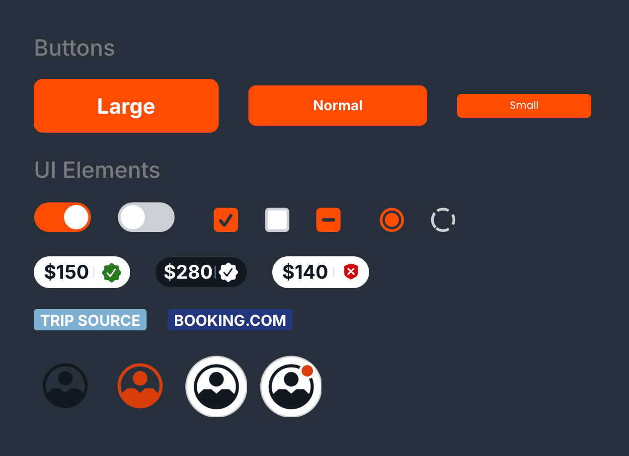
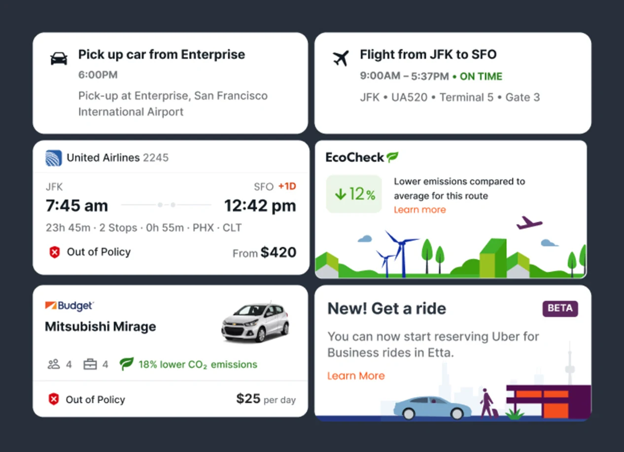
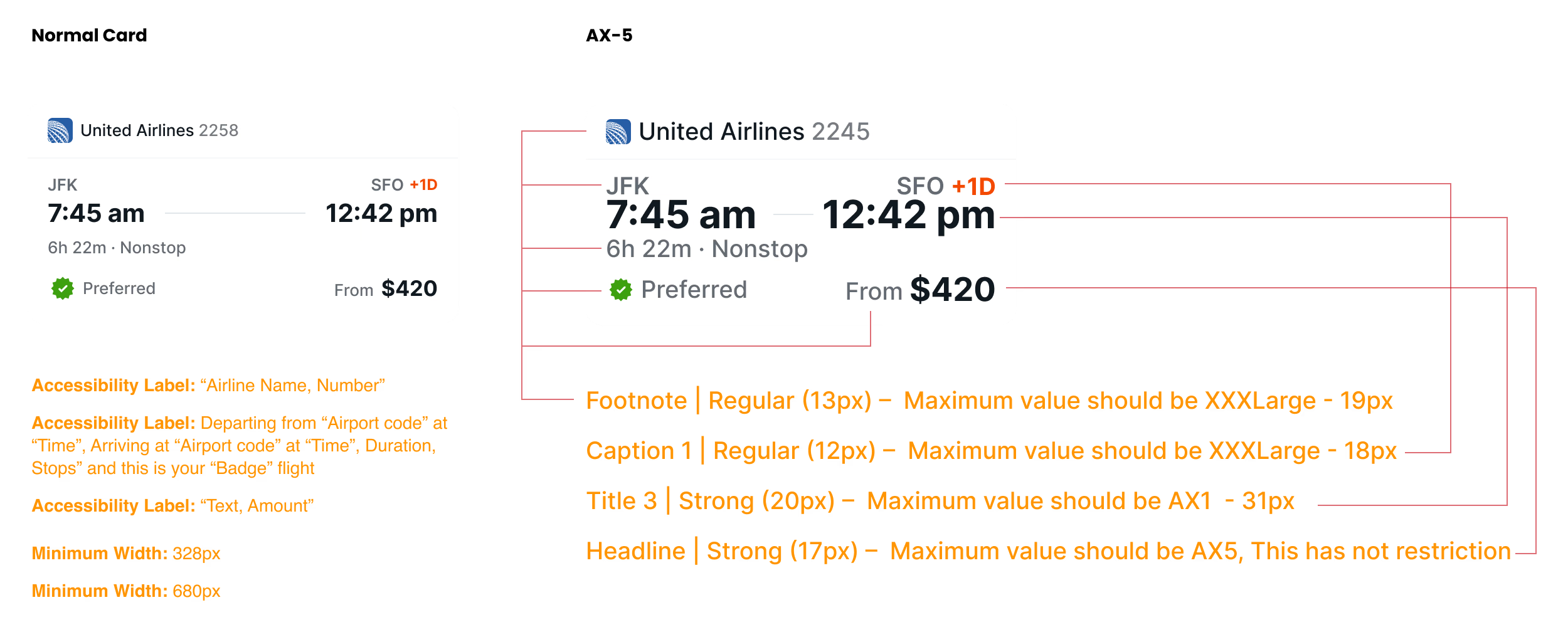
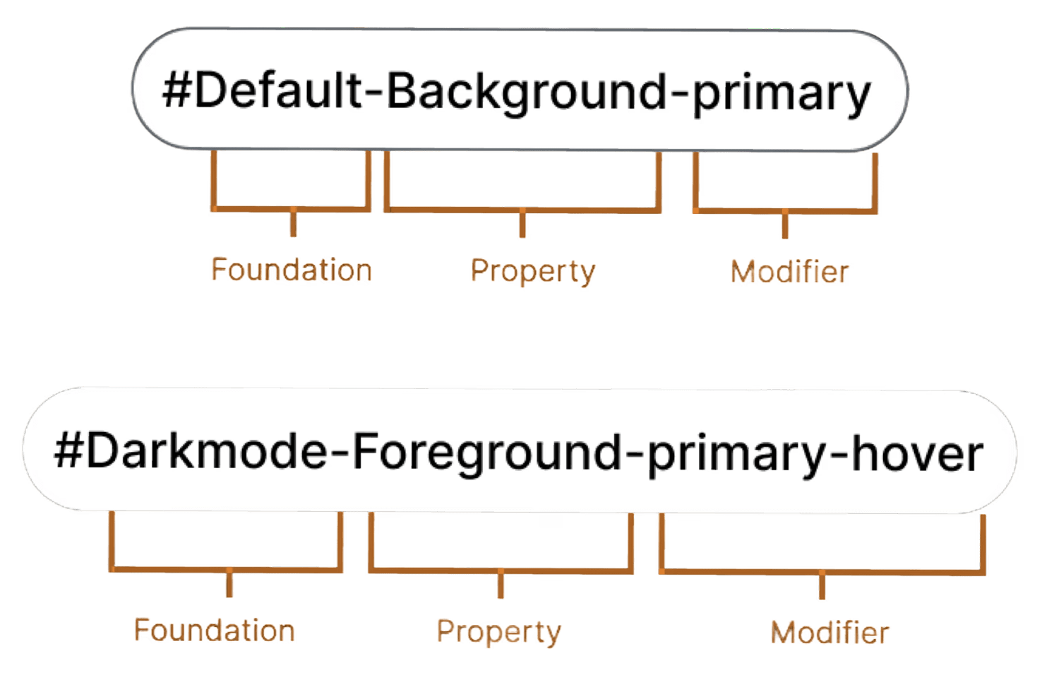
We partnered with Deem to unify and elevate their user experience across products. By removing usability hurdles and introducing award-winning accessibility features, we created a consistent, trusted brand presence in the corporate travel industry. Central to this effort was a scalable, future-proof design system that delighted the engineering team and positioned Deem for growth. This work has contributed to multiple industry awards and recognitions.
error: Content is protected !!