Corporate Travel Management Application
Finally, it’s easier to travel anywhere. With Etta, employees get an effortless and intuitive experience
Our Agenda.
Figma
Miro
Maze
Confluence
Heap analytics
Project Overview.
One of the most interesting projects I worked on was Etta, a corporate travel booking platform designed for business travelers. The goal was to help employees easily book flights, hotels, and transportation while ensuring companies could manage travel policies, approvals, and expenses efficiently.
When I joined the project, the product already had functionality, but users were struggling with the overall experience. The booking journey felt complex, navigation was confusing, and the platform wasn’t meeting the expectations of modern business travelers. My role was to understand these challenges and redesign the experience from the ground up.

Challenge.

When they came to us, their existing design was very basic and with not a lot of focus on key design elements. This resulted in less repetitive clients and a less than satisfactory user experience. The challenge for us was to create a whole new portal that facilitated all travel needs, was easy to use and aesthetically well designed.

  • Poor Accessibility
  • Usability Errors
  • Low Mobile Adoption Rate
  • Inconsistency In Design
Our Approach.

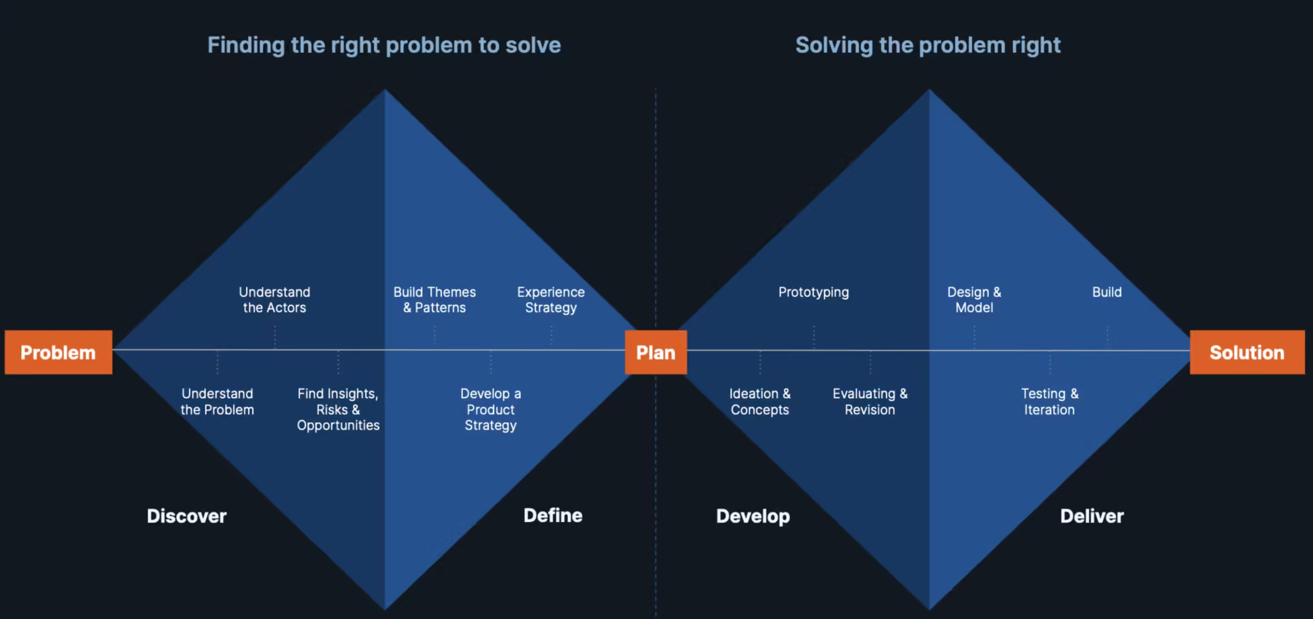
To solve the challenges, we adopted a user-centered and collaborative design process:

  1. Market & User Research – Conducted deep research to define traveler personas and map pain points.
  2. Accessibility First – Aligned every design decision with statutory accessibility guidelines, ensuring inclusivity from the ground up.
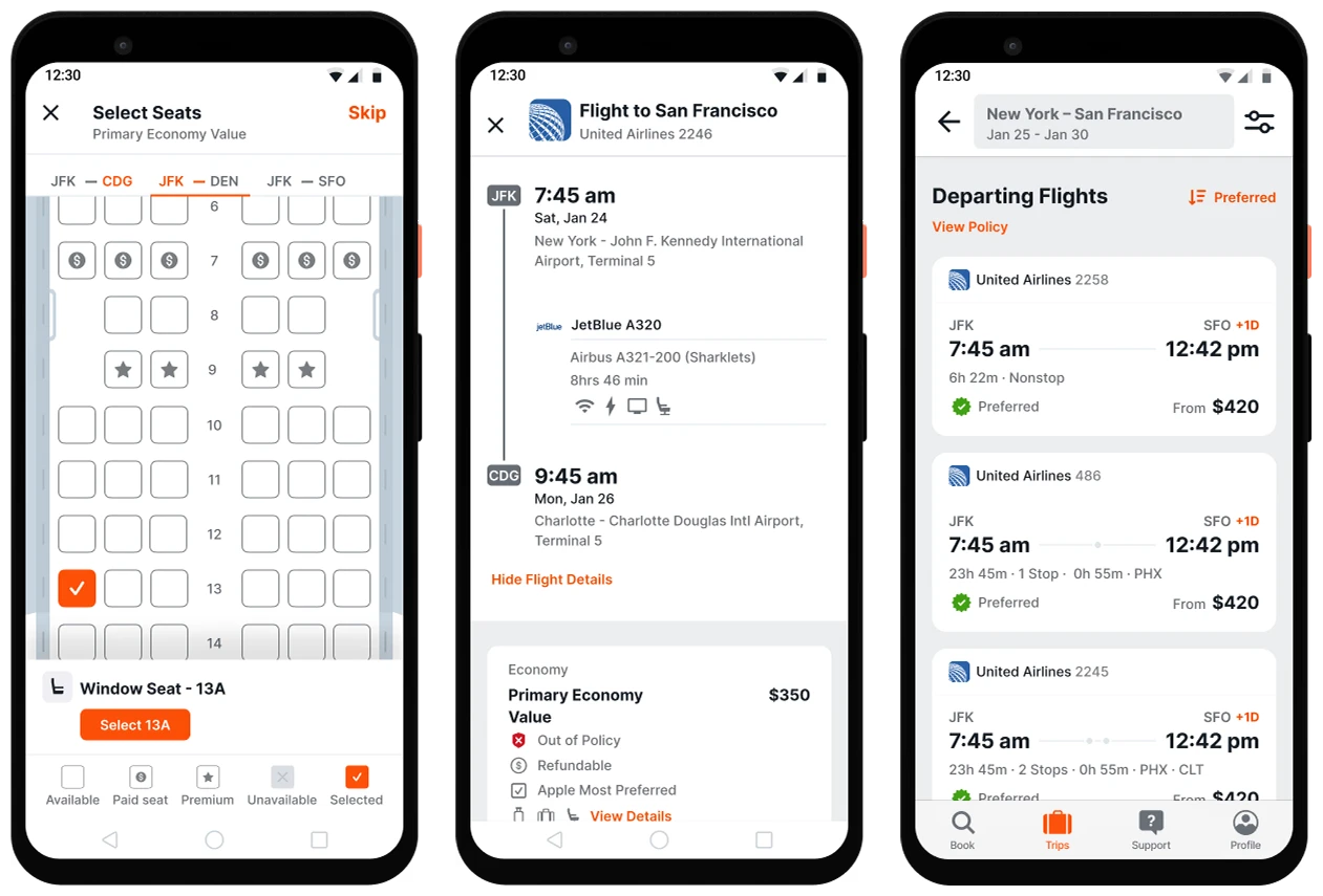
  3. Mobile-First Design – Focused on creating a seamless experience across devices, with mobile as a priority to drive adoption.
  4. Consistency & Usability – Built a unified design system to eliminate inconsistencies and streamline key workflows.
  5. Feature-Centric Design – Tailored user journeys for mobile booking, cab searches, and itinerary management to meet the needs of diverse traveler profiles.
Our in-house team worked hand-in-hand with the client’s product and engineering teams to bring this to life. Using Figma, we crafted intuitive and innovative designs with a constant focus on improving user experience.
Solution.

The solution focused on simplifying every step of the travel journey.

We redesigned the booking flow to reduce cognitive load and help users find flights, hotels, and transportation more efficiently. Navigation was restructured to make important actions easier to discover, and information was organized in a way that supported quick decision-making.

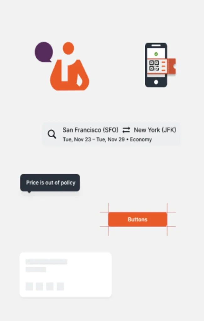
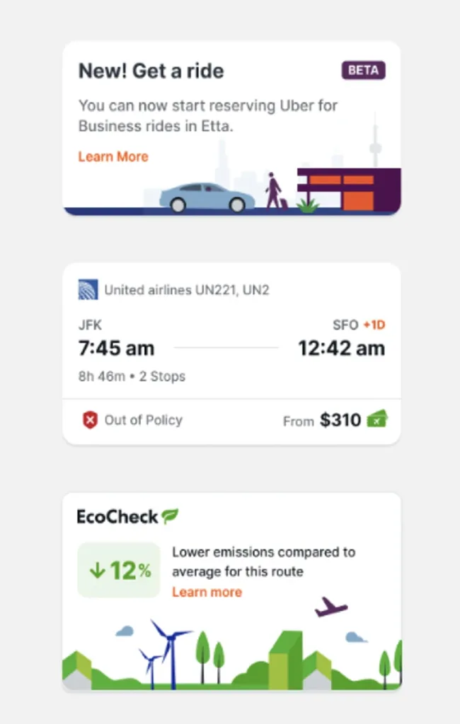
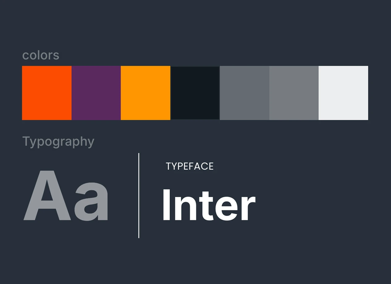
We also introduced a consistent design system with reusable components, standardized typography, color systems, and visual elements. This ensured a seamless experience across all platforms while making future product scaling much easier.

Accessibility and usability improvements were integrated throughout the experience, helping a wider range of users interact with the platform comfortably.

Impact.

The redesign transformed Etta from a feature-heavy platform into a user-centered travel experience.

Users could complete bookings faster, navigate the platform with greater confidence, and manage their travel plans more efficiently. The improved usability reduced friction across the booking journey and significantly enhanced overall user satisfaction.

From a business perspective, the platform became more scalable, easier to maintain, and better aligned with the needs of corporate travelers. The quality of the experience also contributed to industry recognition and design awards, validating the effectiveness of the redesign.

The Begining and the Progress.
Before visual design, user research is conducted with real users to gather insights, ensuring alignment with business goals and user needs.
How it Comes Together.
Having a Consistency, Coherent and Cohesive experience is essential
1.Disorganised
Basically Random Junk.
2.Consistent
Look like it can fit together
3.Cohesive
Fits and Works together
4.Coherent
Work together to achieve a goal
Mobile First Approch.
We design for mobile first, then scale up to larger screens. This approach accounts for smaller displays, slower connections, and touch interactions.
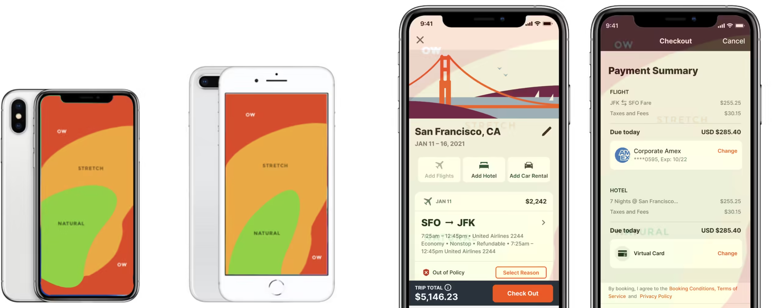
Reachability.
Strategic placement of crucial content and action buttons in easily accessible areas enhances the physical accessibility of the design.
Progressive Discloser Complexity.
Help people focus on primary tasks and content by limiting the number of onscreen controls while making secondary details and actions discoverable with minimal interaction
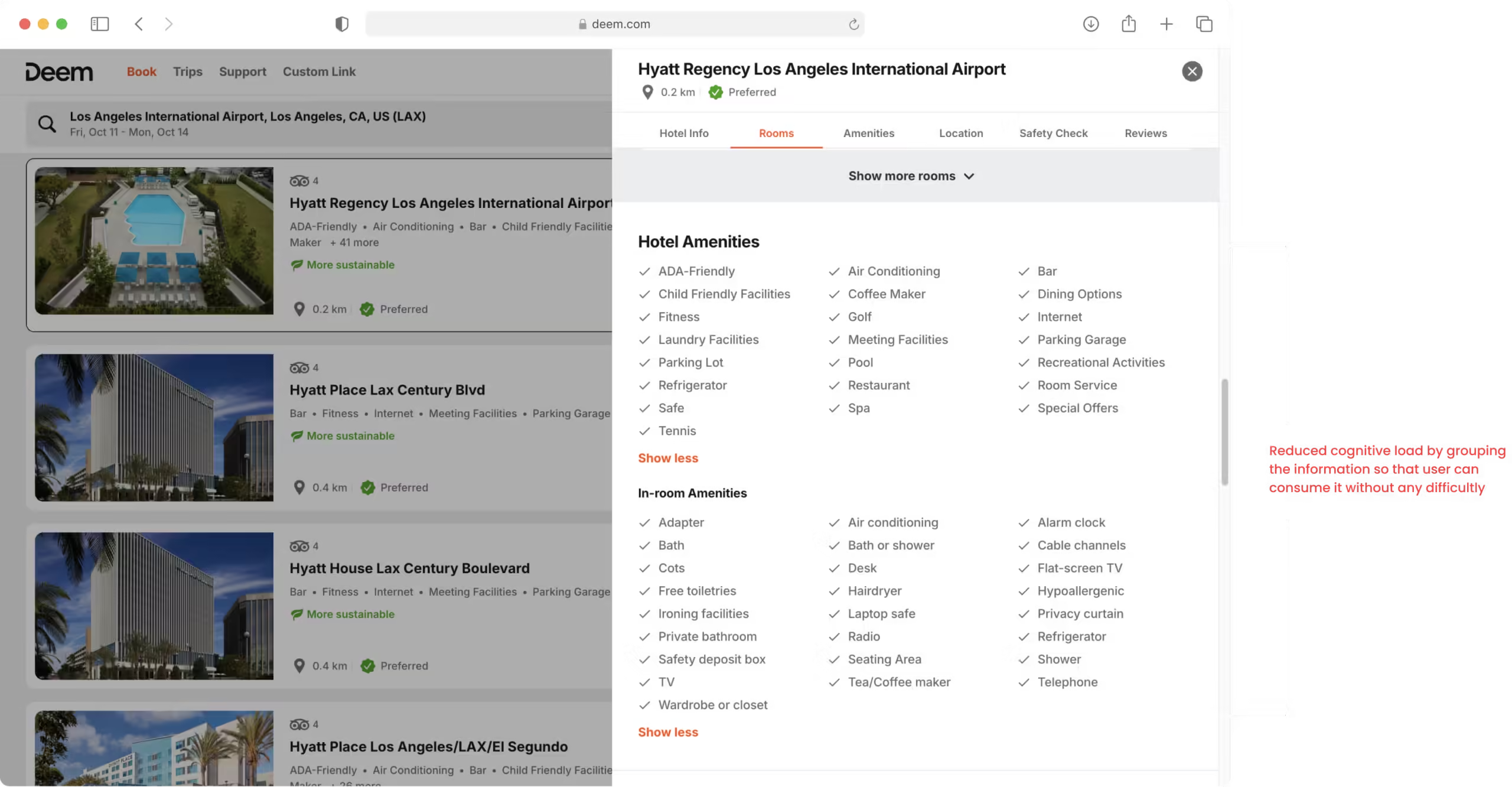
Reduce Cognitive Load.
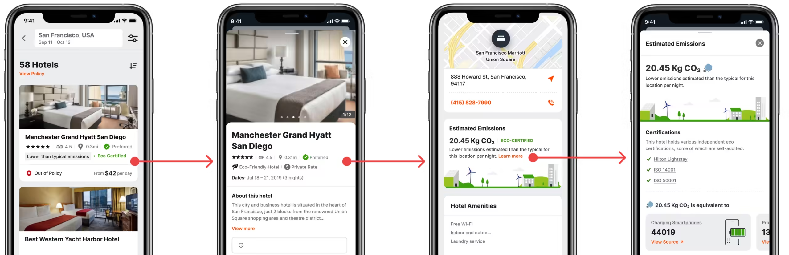
Reduce cognitive load by simplifying the interface, minimizing steps, and presenting clear, organized information. Focus on easy comparisons, familiar icons, and showing only relevant details at each stage of the booking process.
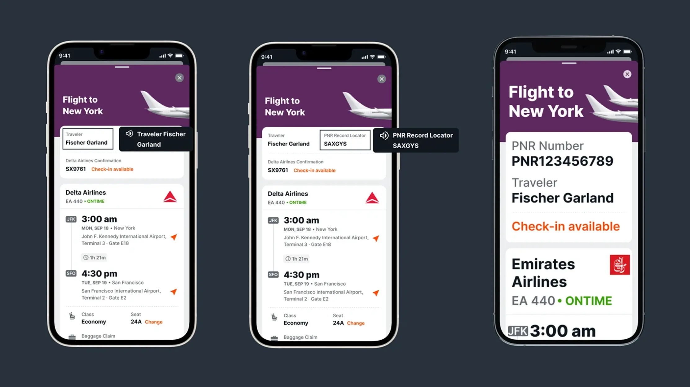
Accessibility & Voice over.
Designing for inclusive experiences with screen readers and voice guidance.
One Design System for all Platforms.
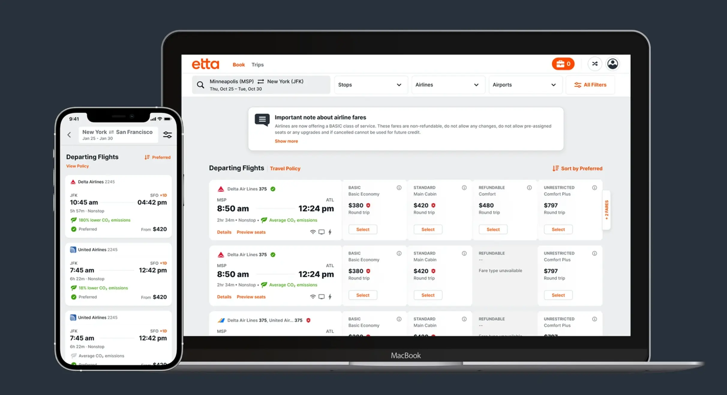
All the platforms i.e iOS, PWA & Desktop will be pointing to the same component from the design system. No more seperate design systems for each platforms
Workflow of Etta.
Using all of the research and ux/ui principles, we designed Etta to provide users with a completely seamless and engaging experience.
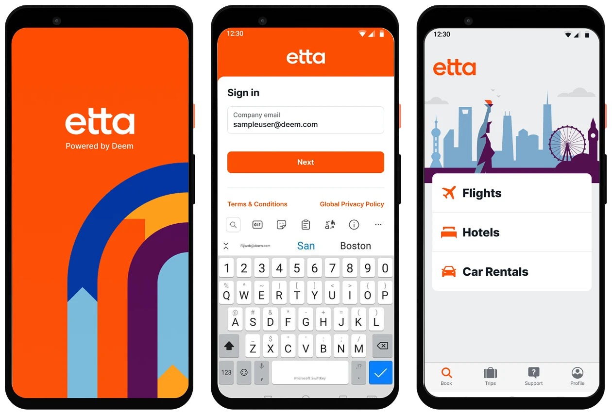
The Beginning
A user will be welcomed by an elegant splash screen when opening the application and must follow a few steps to access the book tab.
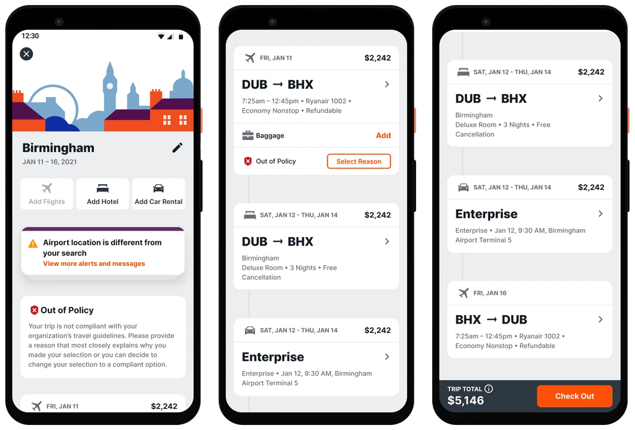
Booking Flow
By selecting any section from the book tab, the user can continue their search and selection
Review Your Trip
Users are able to review all segments added to the trip from the review trip screen after adding them to the trip.
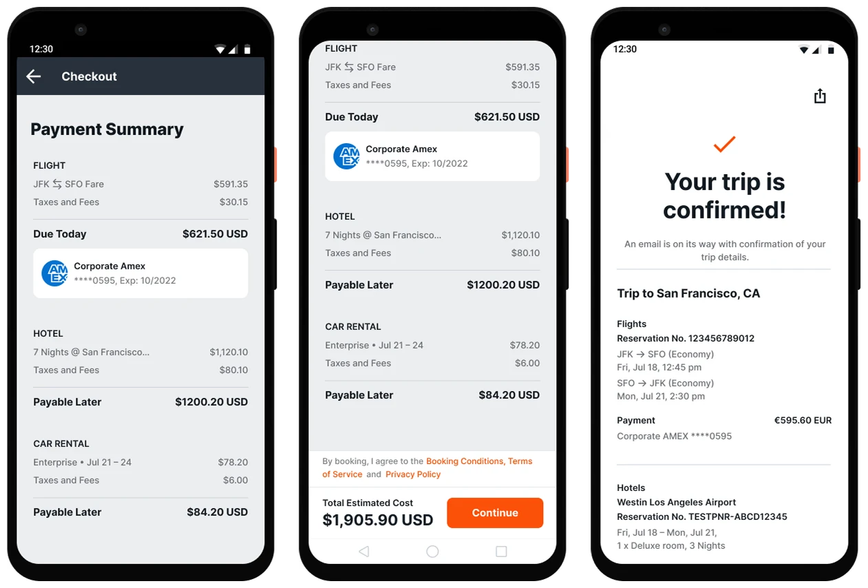
Payment Summary
Once you have reviewed the trip, confirm the booking by checking out all the prices.
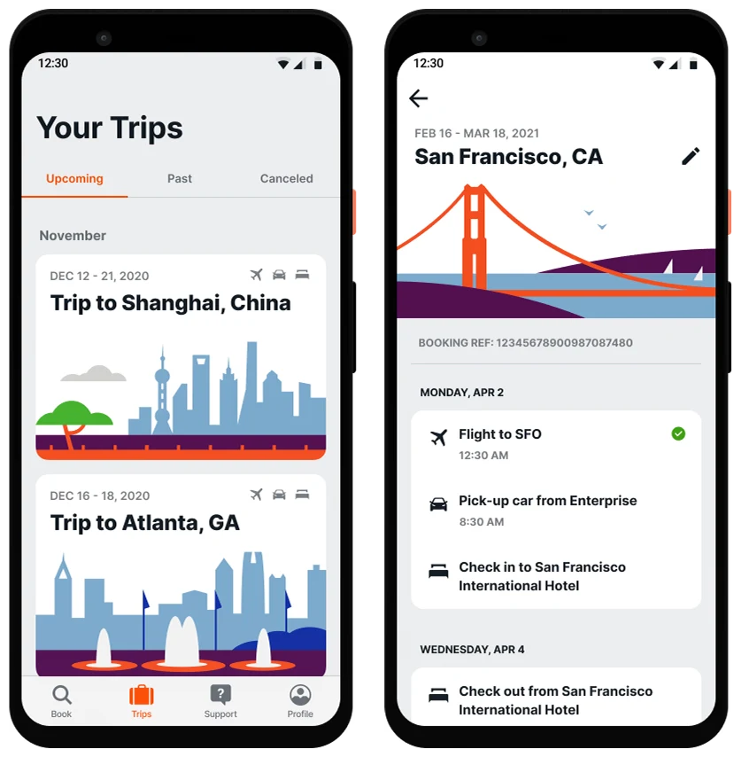
Upcoming Trips
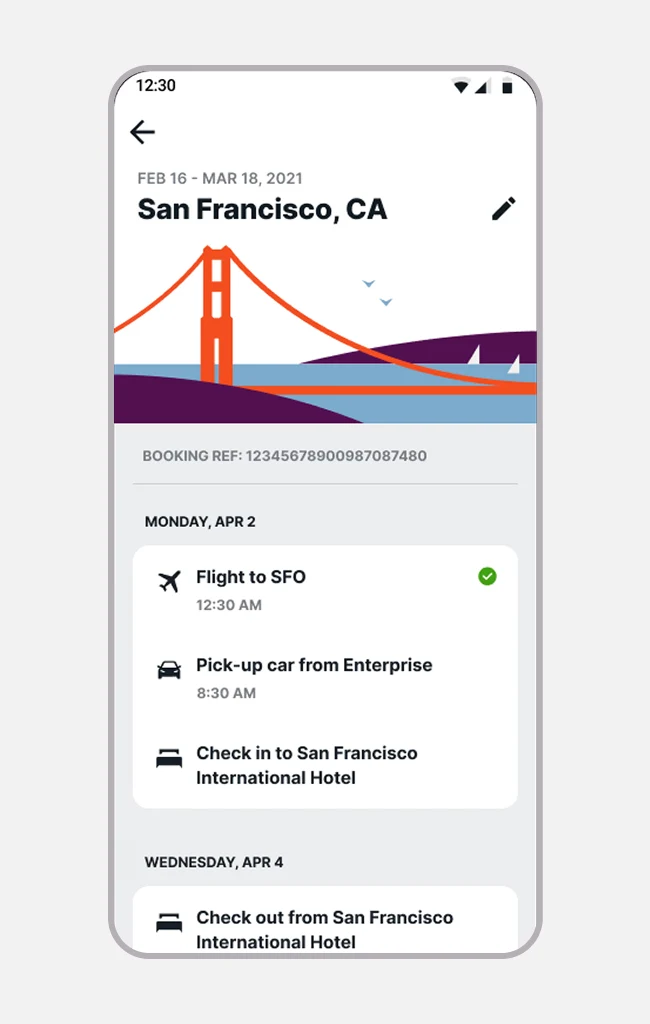
When the user has booked a trip, the trip page will show all the details of all the upcoming trips, past trips, and cancelled trips.
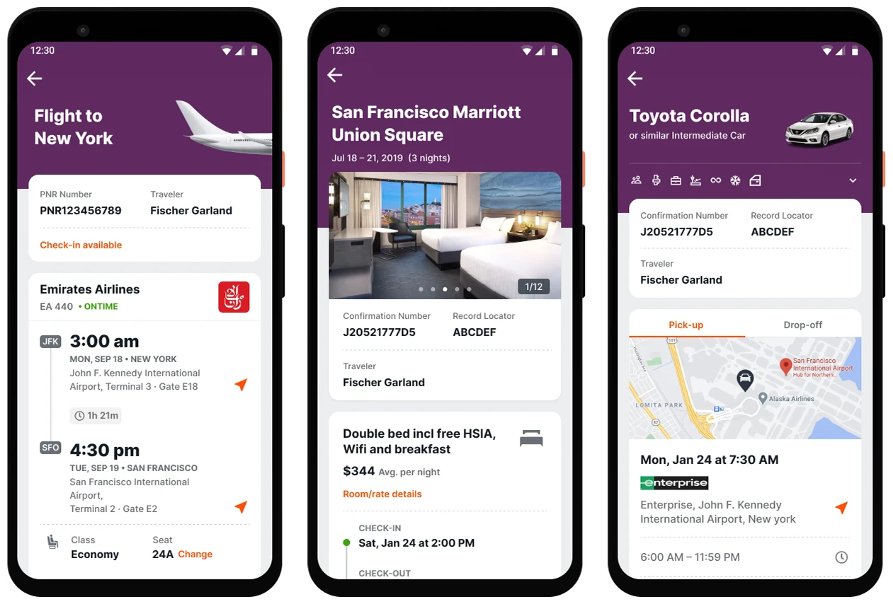
Trip Details
You can find all the information you need for your future booking on the trip detail page
Corporate Travel for Every Body.
Everyone should be able to travel easily. And with Etta, they can. That’s because Etta was designed from the beginning with accessibility in mind. Whether a traveler lives with impaired vision or hearing, or even limited motor or cognitive functions, Etta delivers the information they need, in the way that they need it.
Vision Impairments

Uses a color scheme that meets WCAG contrast guidelines, adjustable text size, and is easy to navigate using screen readers.

Hearing Impairments

Travelers with hearing impairments or deafness can easily get visual and text-based support directly through the app.

Motor Impairments

App supports navigation through a keyboard, specialized switch, or other input devices, with clear indicators of what the focus is on.

Cognitive Impairments

A clean, calm interface that incorporates system level settings allows to cater to travelers with dyslexia or epilepsy.

The Results.
We helped Deem to accelerate the user experience across their products and reduced their support calls. The brand now has a consistent image that people can trust in corporate travel industry. We removed usability hurdles across the board and added award winning accessibility features to the product, and to the engineering team’s great delight, delivered a future-proofed design system built for growth. Deem now has achieved several awards and recognitions
error: Content is protected !!